
Context
Before the Project Became a Brief.
Nexus did not have a data shortage. It had a decision-speed problem. Important signals existed across millions of records, but reaching a useful answer required slow reports and specialist intervention.
Problem
What Was Really Getting in the Way.
Nexus, a Fortune 500 logistics firm, was drowning in data. Their legacy ERP system generated millions of rows of supply chain data daily, but this data was buried in slow, tabular reports. Executives struggled to make timely decisions because retrieving insights took hours.
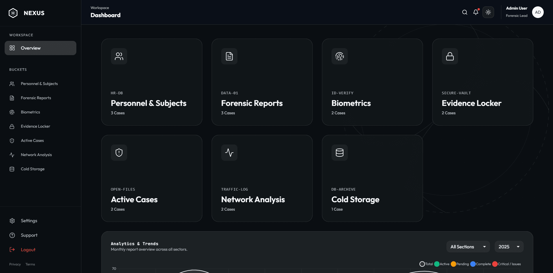
They needed a dashboard that could render 1M+ data points instantly and provide "Drill-Down" capabilities from a global view to a single truck's individual cargo, all within a UI intuitive enough for non-technical C-suite users.
The big move
The project moved forward once every screen was tied to a decision an operator or executive needed to make. Visualization became a navigation system through the organization, not a decorative layer over the ERP.
Build
How the Idea Became a Working System.
We built a bespoke data visualization engine using React and D3.js. To handle the massive dataset, we implemented "Windowing" or virtualization, rendering only the DOM nodes currently visible to the user, keeping the application memory footprint low.
We designed a "Command Center" UI with a dark mode tailored for low-light control rooms. The backend was migrated to a GraphQL architecture, allowing the frontend to request only exactly the data needed for each specific chart, reducing network payload by 90% and enabling sub-second load times.
Design from decisions backward
Dashboard hierarchy was based on operational questions, with progressive drill-down from global performance to individual shipments.
Render only what matters
Virtualization kept large datasets responsive by limiting interface work to the information currently in view.
Reduce the payload
GraphQL queries returned only the data required by each visualization, improving speed and reducing unnecessary transfer.
Impact
What Changed After Launch.
Decision latency dropped from hours to seconds. The "Predictive Logistics" widget, which we built to visualize potential delays, saved the company an estimated $2M in Q1 alone by allowing them to reroute shipments before bottlenecks occurred.
The dashboard is now the central hub for their daily operations, adopted by 12 global regional offices within a month of beta release.
1M+
Data Rows
<50ms
Latency
Enterprise dashboards create value when they shorten the distance between a signal and an informed action. Every technical choice supported that distance.
What the project reinforced